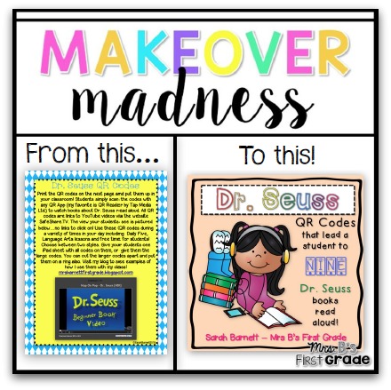
I am happy to say that I *finally* completed the TpT Seller Challenge for week one! This challenge was the perfect push for me. I have taken a step back from my store to work on my marketing. Now I am wanting to get back to my “in progress” products and revamp some of my current ones. I have been wanting to revamp the covers on my QR Read Aloud packs. They currently do not technically even have a cover. So, anything is an improvement!
I decided to make a cover for my best seller, my Dr. Seuss QR Read Aloud codes. It took me F-O-R-E-V-E-R! I wanted to make it simple, but still appealing. I always worry about silly things and nit-pik my designs. I finally think I am happy with it. I wanted to make the cover square and create one that could be used with all of my QR products. Here is where I would love some feedback from you!
Thanks for your feedback! As a thank you, I have made the Dr Seuss Read Aloud QR Codes half off through the weekend. That means they are ONLY 75 cents!


Hi Sarah, First of all, the cover looks great! I would keep the clipart and just change the background and title. I like consistency through similar products but that's just my thought. (This might be a re-post I don't know if my first one posted and I got kicked out)
Hi! Thanks SO much for the feedback! I think that is what I am going to do. My goal is to make them all a square cover first. Then, maybe I will fancy up the other pages in the products. If only there was more time… 😉
Sarah